Transform your space with the ideal color palette that reflects your unique style and creates a visually captivating ambiance. Consider the emotional impact each color brings – from the passion of red to the calmness of blue – and aim for a harmonious balance that evokes the right mood. Experiment with color harmonies like complementary contrasts or monochromatic schemes to achieve visual appeal. Maximize smaller spaces with space-saving colors and reflective surfaces while incorporating accent pieces strategically. And remember, the key is to blend colors in a way that speaks to you and creates a space that truly resonates with your taste and aesthetic preferences.
Key Takeaways
- Consider color psychology to evoke desired emotions and create ambiance.
- Balance warm and cool tones for visual appeal and spatial perception.
- Experiment with color harmonies like complementary or monochromatic schemes.
- Utilize natural light and proper lighting to enhance color vibrancy.
- Incorporate textures and accents to add depth and visual interest to the space.
Importance of Color Selection
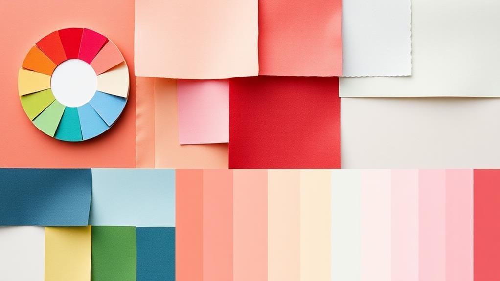
Selecting the right color palette is crucial when it comes to design and interior décor. Color trends play a significant role in setting the tone for a space, reflecting the current styles and moods. Understanding the cultural significance of colors can also add depth and meaning to your design choices.
When exploring color trends, consider popular palettes like serene pastels for a calming effect or bold, bright colors to make a statement. Each hue carries cultural significance; for example, red symbolizes energy and passion in many cultures, while blue evokes serenity and trust. By incorporating these meanings into your design, you can create spaces that resonate with people on a deeper level.
Whether you opt for classic combinations or daring contrasts, the colors you choose will define the ambiance of your space. Striking a balance between aesthetics and emotional impact is key to creating a harmonious design that speaks to both style and soul.
Color Psychology Basics
Let's unravel the enchanting world of color psychology together.
You'll discover how colors hold immense power, evoking a spectrum of emotions and associations within us.
Understanding these impactful connections can truly transform the ambiance and mood of any space.
Impact of Colors
Color psychology is a fascinating aspect of design and interior decoration, influencing our emotions, behaviors, and perceptions in ways we often don't consciously realize. The impact of colors goes beyond aesthetics; they've the power to evoke specific feelings and set the tone for a space.
Here are four key points to help you understand the significance of colors:
- Color Symbolism: Different colors hold various meanings across cultures. For example, while white signifies purity in Western cultures, it represents mourning in some Eastern cultures.
- Cultural Significance: Colors can be deeply rooted in culture, reflecting traditions, beliefs, and historical contexts. Incorporating culturally significant colors can add richness and authenticity to a design.
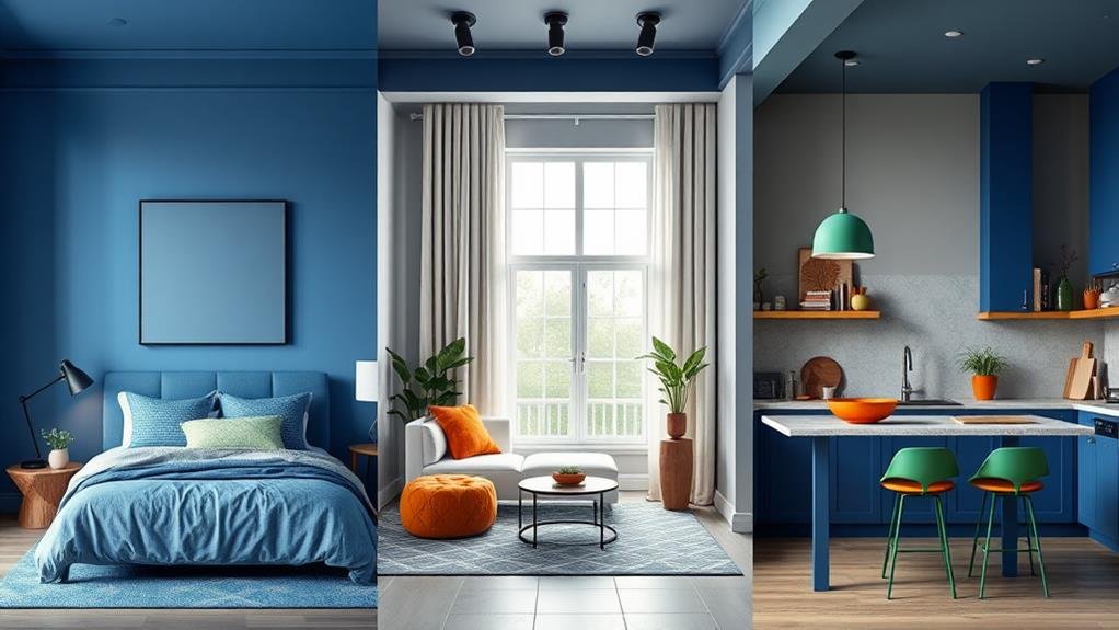
- Psychological Effects: Colors can affect mood and behavior. Warm colors like red and yellow tend to energize and stimulate, while cool colors like blue and green have a calming effect.
- Visual Impact: The arrangement and combination of colors can create visual harmony or contrast, impacting how a space is perceived and experienced by individuals.
Emotional Associations
A harmonious blend of colors can do more than just catch the eye; it can profoundly impact our emotions and behaviors. Colors have diverse meanings influenced by cultural backgrounds, personal preferences, seasonal trends, and brand identities, triggering emotional responses and symbolizing various concepts. The memory associations linked with colors can evoke psychological effects, shaping our aesthetic choices.
For instance, red is often associated with passion and intensity, evoking strong emotions. Blue, on the other hand, symbolizes trust, calmness, and stability. These emotional associations with colors are deeply ingrained in our minds and can influence how we feel in a particular space.
Understanding the emotional responses tied to different hues can help in creating environments that cater to specific moods or activities.
Keep in mind that colors have the power to communicate without words, making them a vital aspect of design. By considering the emotional impact of each color, you can craft a palette that resonates with your vision and elicits the desired feelings within a space.
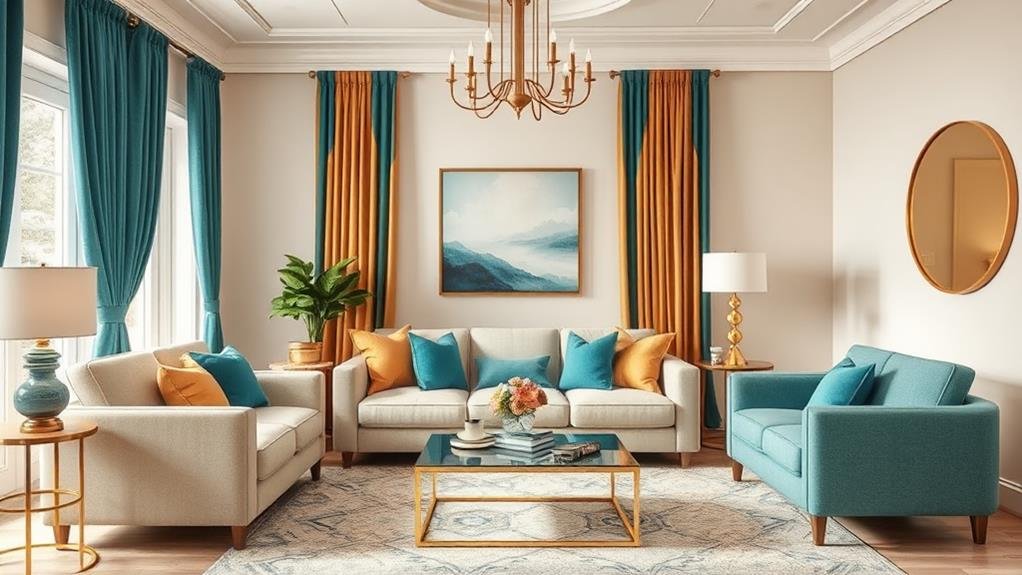
Understanding Color Harmonies
Amidst the vast spectrum of colors available to you, understanding color harmonies is key to creating visually pleasing designs and interiors.
Dive into the world of color theory to grasp the magic behind complementary colors, saturation levels, and the color wheel. Here's a breakdown to guide you through the kaleidoscope of color possibilities:
- Embrace Complementary Colors: Pair hues that sit opposite each other on the color wheel for striking color contrast.
- Experiment with Monochromatic Schemes: Play around with variations of a single color by adjusting its saturation levels for a harmonious look.
- Balance Warm and Cool Tones: Mix warm tones like reds and yellows with cool tones such as blues and greens to create a well-rounded aesthetic.
- Consider Color Temperature for Visual Balance: Understand the impact of warm colors advancing and cool colors receding in a space to achieve a visually balanced design.
Tips for Small Spaces
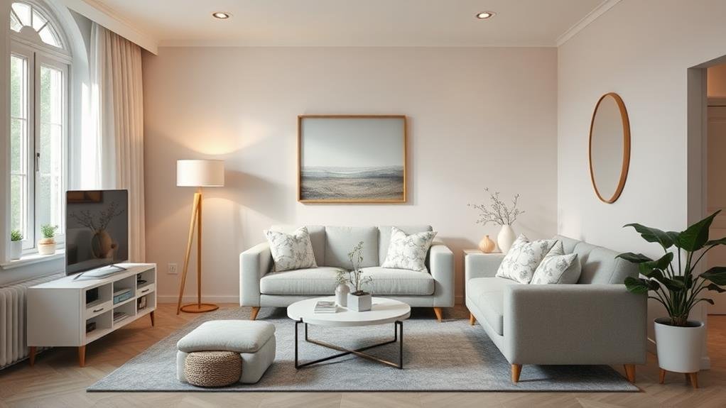
Unlock the potential of your small space with smart design choices that maximize every inch. When working with limited square footage, it's essential to choose colors and design elements that create an illusion of space while also reflecting your personal style. Consider space-saving colors and multifunctional hues to add depth and dimension to your rooms. Incorporating reflective surfaces can help bounce light around, making the area feel larger and brighter. Opt for color continuity to establish visual boundaries without closing off sections. Explore warm versus cool tones to set the ambiance you desire. Soft textures can add coziness without overwhelming the room. Enhance the space with layered lighting for a well-lit, inviting atmosphere. Embrace minimalist designs with personalized touches to make the space feel uniquely yours. Check out the table below for quick tips on maximizing your small space:
| Space-Saving Colors | Multifunctional Hues | Reflective Surfaces | Color Continuity |
|---|---|---|---|
| Whites | Light neutrals | Mirrors | Monochromatic |
| Light Blues | Soft Greens | Glass | Tone-on-tone |
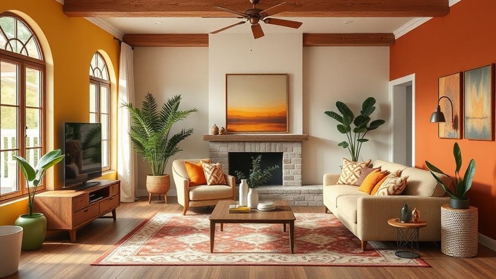
Bold vs. Neutral Palettes
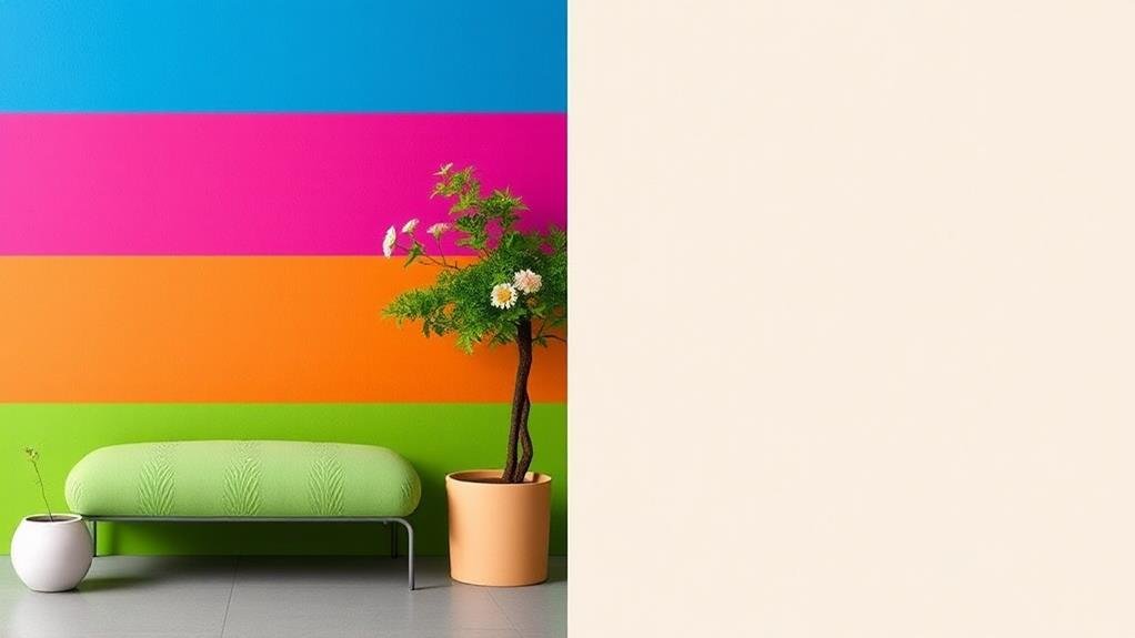
Exploring the realm of design further, the interplay between bold and neutral color palettes offers a dynamic range of options to elevate your space.
When it comes to choosing a color palette for your design and interior, deciding between bold aesthetics and neutral warmth can greatly impact the overall feel of your space.
Here are some key points to consider:
- Color Contrasts: Bold palettes create striking contrasts that instantly capture attention, while neutral palettes offer a more soothing and subtle vibe.
- Palette Versatility: Bold colors are great for making a statement, but neutral tones provide more flexibility when it comes to changing accessories or furniture pieces.
- Emotional Response: Bold colors can evoke strong emotions like excitement or energy, while neutrals promote a sense of calm and relaxation.
- Design Cohesion: Achieve visual balance by mixing bold hues with neutrals for a harmonious look that allows for personal expression through varying textures and accent pieces.
Trending Color Schemes
Delve into the captivating world of design trends by exploring the latest in color schemes that are making waves across interiors and aesthetics.
Trending palettes range from bold and vibrant contrasts to soothing earthy tones and chic monochromatic schemes. Seasonal colors play a significant role, incorporating fresh hues for spring, warm tones for summer, deep shades for fall, and icy colors for winter.
Minimalist designs are embracing retro hues, bringing a touch of nostalgia to contemporary spaces. Color blocking is another trend on the rise, with sharp contrasts creating visually striking interiors.
Influenced by various industries and cultural inspirations, color schemes are becoming more diverse and unique. Keep an eye out for unexpected combinations and unconventional choices that push the boundaries of traditional design.
Whether you prefer a subtle elegance or a bold statement, there's a trending color scheme out there to suit every taste and style. Be daring, be expressive, and let your space reflect the dynamic nature of modern design trends.
Lighting Considerations
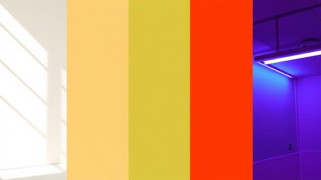
As design trends continue to evolve, one aspect that shouldn't be overlooked is the impact of lighting on the overall look and feel of a space.
When considering lighting for your design and interior, it's crucial to take into account various elements that can enhance or diminish the visual appeal of your space. Here are some key factors to consider:
- Natural Light: Utilize natural light to create a bright and airy atmosphere in your space, making colors appear more vibrant and true to their hue.
- Artificial Light: Choose light fixtures that complement your color palette while providing ample illumination to avoid color distortion.
- Color Temperature: Consider the color temperature of your lighting to match the desired ambiance, whether warm or cool tones are preferred.
- Light Intensity and Shadow Effects: Play with light intensity and shadow effects to create depth and drama within your space, enhancing the overall visual interest.
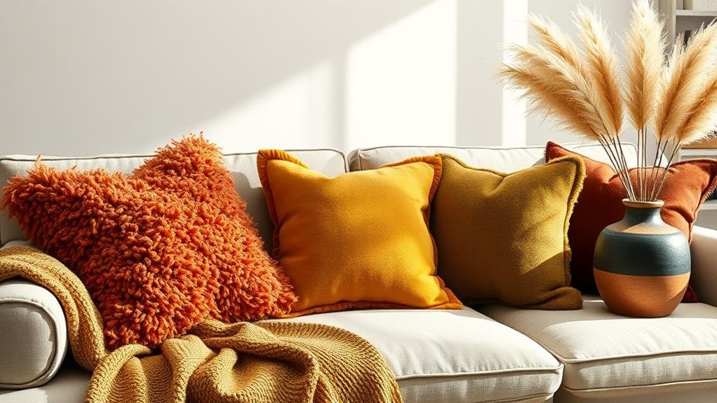
Adding Accents & Textures
Ready to elevate your design game?
Texture and visual interest can truly transform a space, adding depth and allure.
Accent colors are the secret weapon for making your design pop and creating a cohesive aesthetic.
Texture and Visual Interest
Exploring Texture and Visual Interest can elevate your design and interior spaces from ordinary to extraordinary.
By incorporating texture layering, visual contrast, tactile materials, and surface finishes, you can create a visually rich and engaging environment.
Here's how to make the most out of texture and visual interest in your design:
- Texture Layering: Combine different textures like silk, velvet, or knit to add depth and dimension to your space.
- Visual Contrast: Pair rough textures with smooth ones to create a dynamic visual impact.
- Tactile Materials: Opt for materials such as wood, stone, or metal to add a touch of sophistication and warmth.
- Surface Finishes: Experiment with glossy, matte, or metallic finishes to enhance color depth and create a luxurious feel.
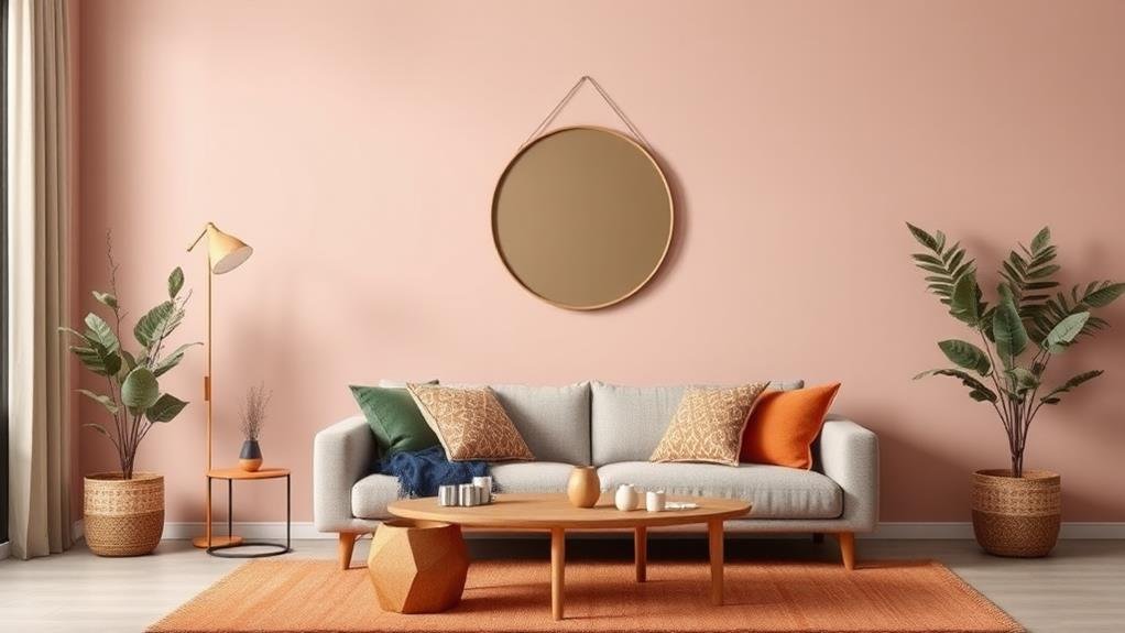
Accent Colors for Pop
Elevate your design and interior aesthetics with the strategic use of accent colors for that extra pop of visual interest.
Choosing the perfect accent colors can transform a space, adding depth and personality. Start by considering complementary colors or contrasting shades to bring vibrancy to your design.
Opt for vibrant accents to create focal points that draw the eye. Integrate subtle highlights to add a touch of sophistication and elegance.
Experiment with seasonal palettes to stay on-trend and refreshing. Incorporate thematic colors to create a cohesive and harmonious look.
Explore the art of color layering to add complexity and richness to your design. Pay attention to spatial dynamics, using accent colors to highlight or visually expand areas within a room.
Creating a Mood Board
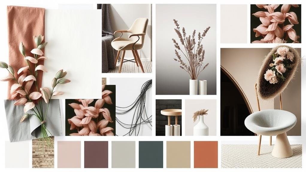
As you embark on the journey of creating a mood board for your design or interior project, visualize your aspirations and inspirations coming together on a tangible canvas.
To craft a compelling mood board, consider the following essential steps:
- Inspirational Sources: Gather images, fabric swatches, textures, and even snippets from magazines that resonate with your design vision.
- Collaborative Brainstorming: Engage with others to bring fresh perspectives and ideas into your mood board creation process.
- Theme Representation: Ensure that the elements on your mood board convey the theme or mood you want to achieve in your design.
- Visual Storytelling: Arrange your materials in a visually appealing and coherent manner to tell a story about your design concept.
Utilize digital tools to enhance your mood board with color swatches, material samples, and other elements that will help you visualize how your design choices will come together.
Organize your layout thoughtfully, considering material selection, seasonal influences, and the overall aesthetic you aim to achieve.
Virtual Room Visualization Tools
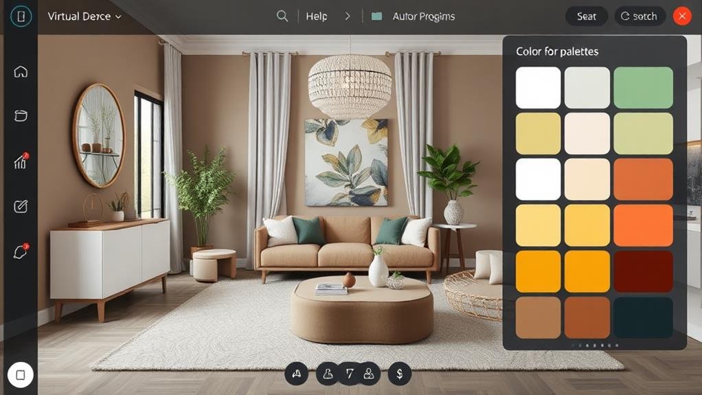
Delve into the realm of design possibilities with Virtual Room Visualization Tools, where your creative vision can materialize into virtual reality. These interactive tools offer a seamless experience through user-friendly interfaces that bring your ideas to life.
With virtual staging and realistic renderings, design software enables you to experiment with different color sampling, textures, and layouts in a three-dimensional space. From space planning to style visualization, these tools allow you to envision your interior design projects with incredible detail.
Using 3D modeling capabilities, you can navigate through customizable templates to find the perfect color palette that suits your taste and preferences.
Whether you're a professional designer or a hobbyist, these virtual room visualization tools provide a platform for exploring endless design possibilities. Say goodbye to guesswork and trial-and-error, and say hello to a more efficient and precise way of designing your space.
Let your imagination soar as you mix and match colors, experiment with different styles, and bring your dream interior to life before even lifting a paintbrush.
DIY Color Mixing Techniques
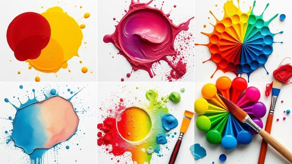
Bringing your design vision to life involves more than just choosing colors from a palette; it's about creating shades that reflect your unique style.
When it comes to DIY color mixing techniques, the possibilities are endless. Here are four essential tips to master the art of color blending:
- Understanding the Color Wheel: Familiarize yourself with primary and secondary colors to grasp how different hues blend together. Experiment with complementary colors for striking combinations.
- Paint Ratios: Adjust the ratios of colors to achieve different saturation effects. Start with small increments and build up as needed to avoid overpowering a shade.
- Blending Techniques: Explore acrylic mixing for bold colors with fluid consistency or try watercolor fusion for a subtle, ethereal look. Practice layering colors to create depth and dimension in your designs.
- Hue Adjustments: Fine-tune your shades by making subtle hue adjustments. Play around with different tones until you achieve the perfect balance that fits your design aesthetic.
Seeking Professional Consultation
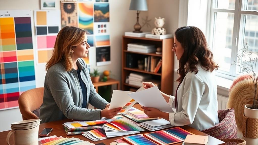
Before embarking on your interior design journey, consider the benefits of seeking professional consultation. A color consultation can provide you with invaluable design expertise and professional guidance tailored to your needs. Here is a closer look at the advantages of seeking expert help for your project:
| Benefits of Professional Consultation | |
|---|---|
| Aesthetic Evaluation | Receive a thorough evaluation of your space's aesthetic appeal. |
| Personalized Services | Enjoy personalized services that cater to your unique preferences. |
| Expert Recommendations | Gain expert recommendations on color palettes and design elements. |
| Project Collaboration | Collaborate with professionals to ensure your vision is realized. |
| Implementation Strategies | Get assistance in implementing design strategies for your space. |
Professional consultation not only guides you in selecting the perfect color palette but also aids in the seamless execution of your design vision. From visual storytelling to fine-tuning your space, experts can elevate your interior design journey with their knowledge and skills.
Conclusion
In conclusion, remember to play with color palettes for your design and interior with purpose and passion. Mix and match hues harmoniously, embrace bold choices bravely, and seek professional guidance generously. Let your space speak volumes with vibrant, versatile, and visually appealing colors that create a harmonious haven. Don't be afraid to experiment with the endless possibilities of color to craft a captivating and cohesive space that truly reflects your style and personality. Cheers to creating a colorfully captivating ambiance!